3 FEST
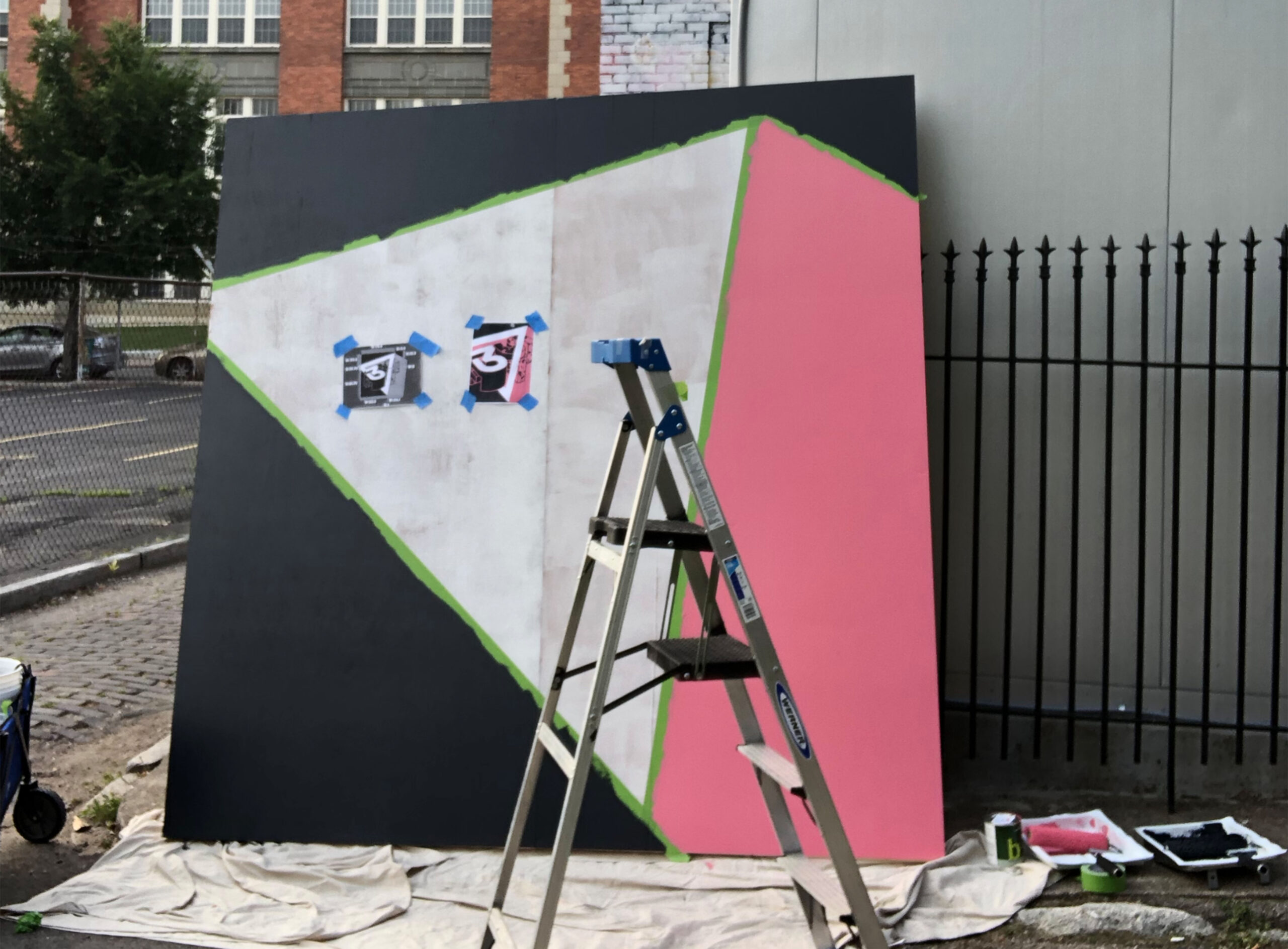
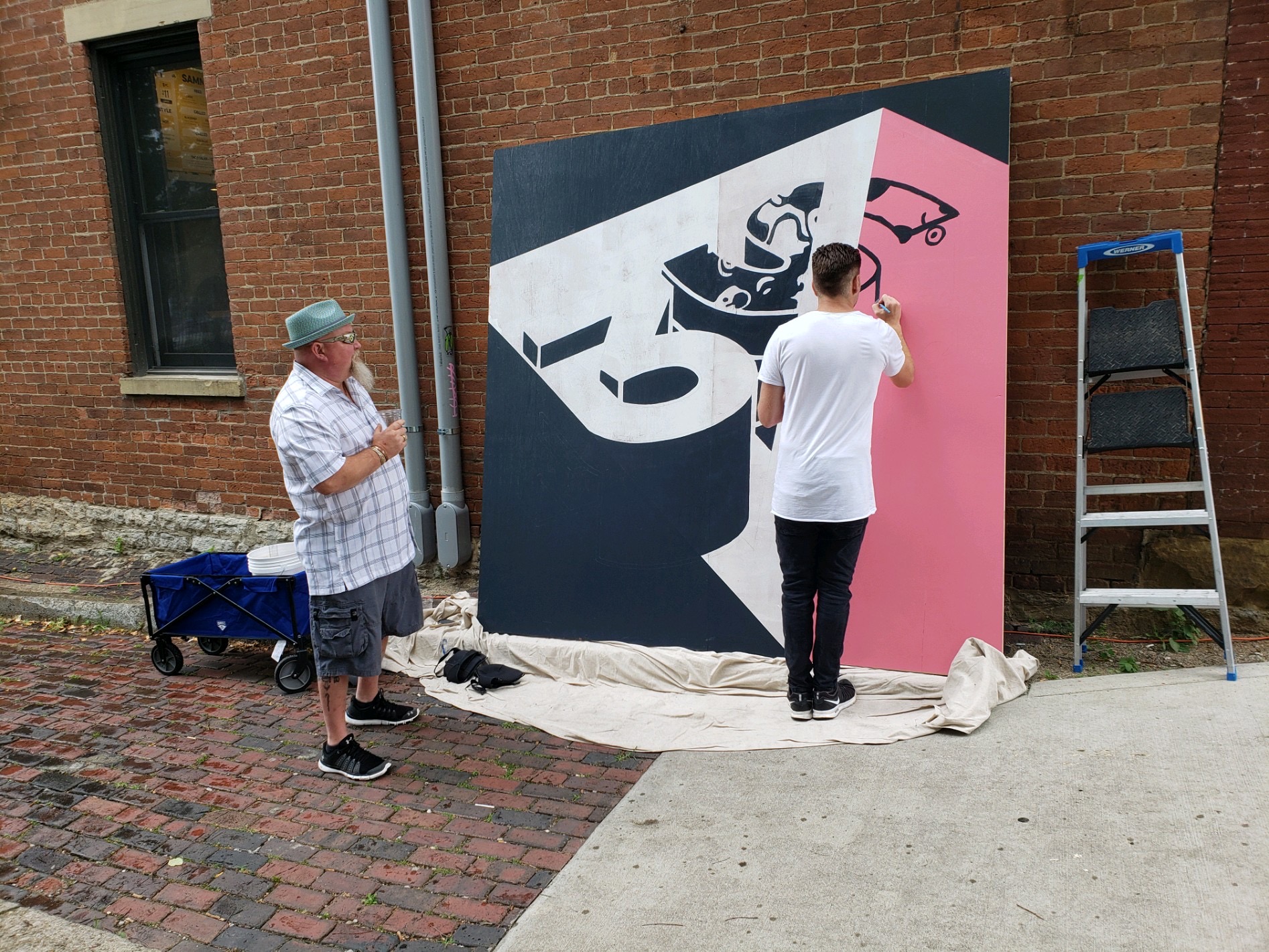
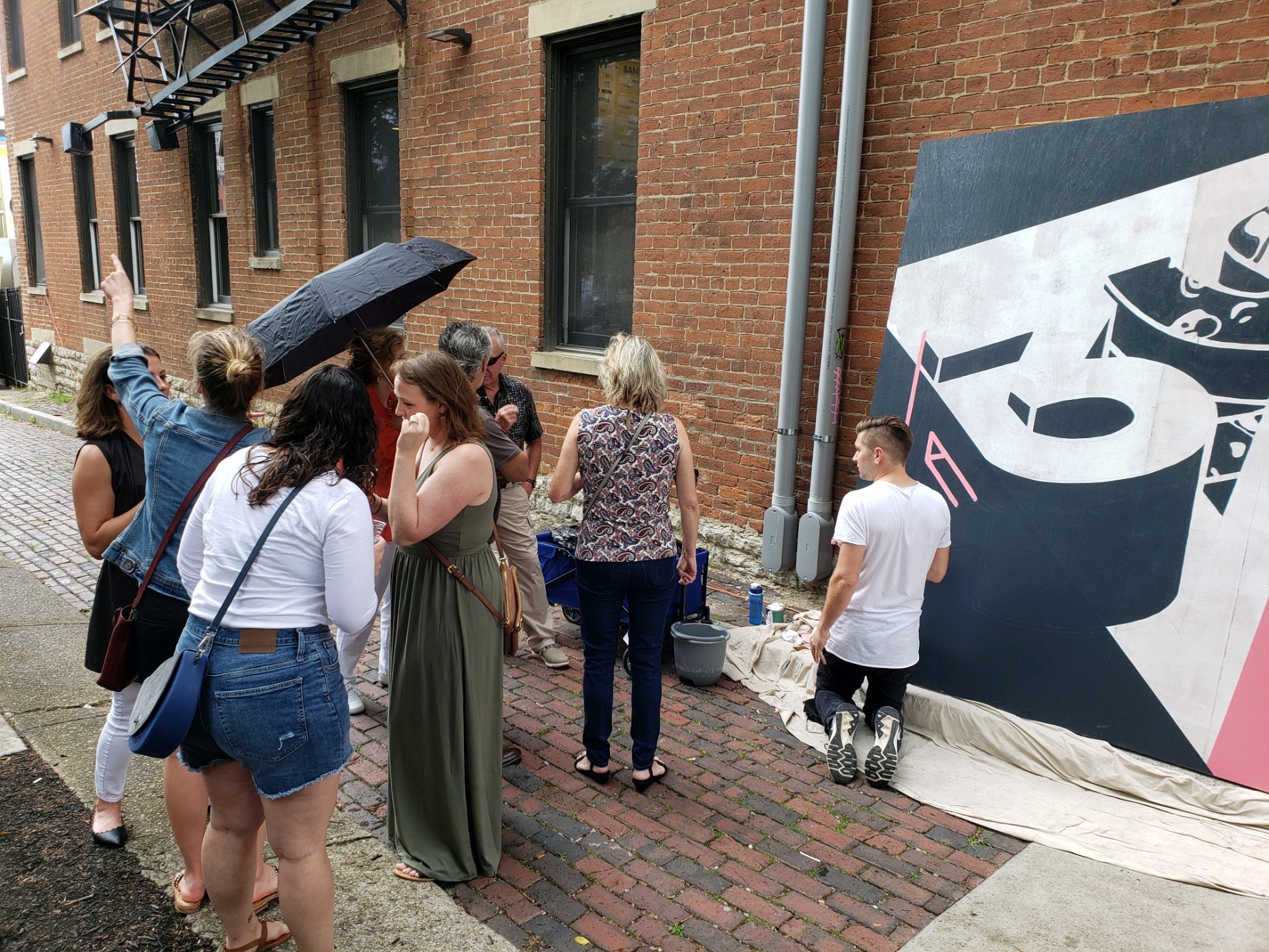
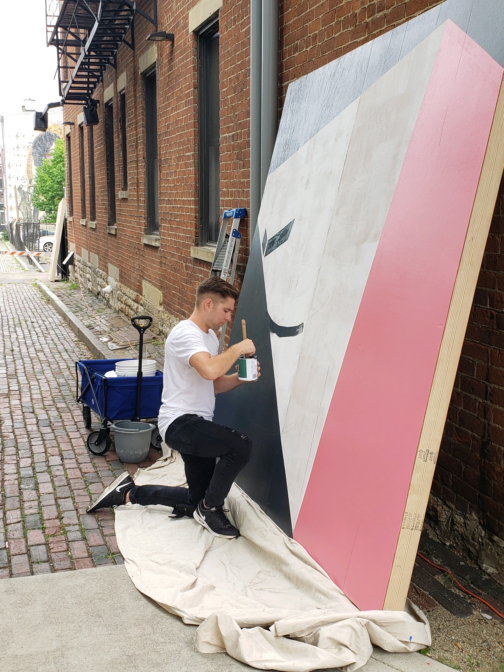
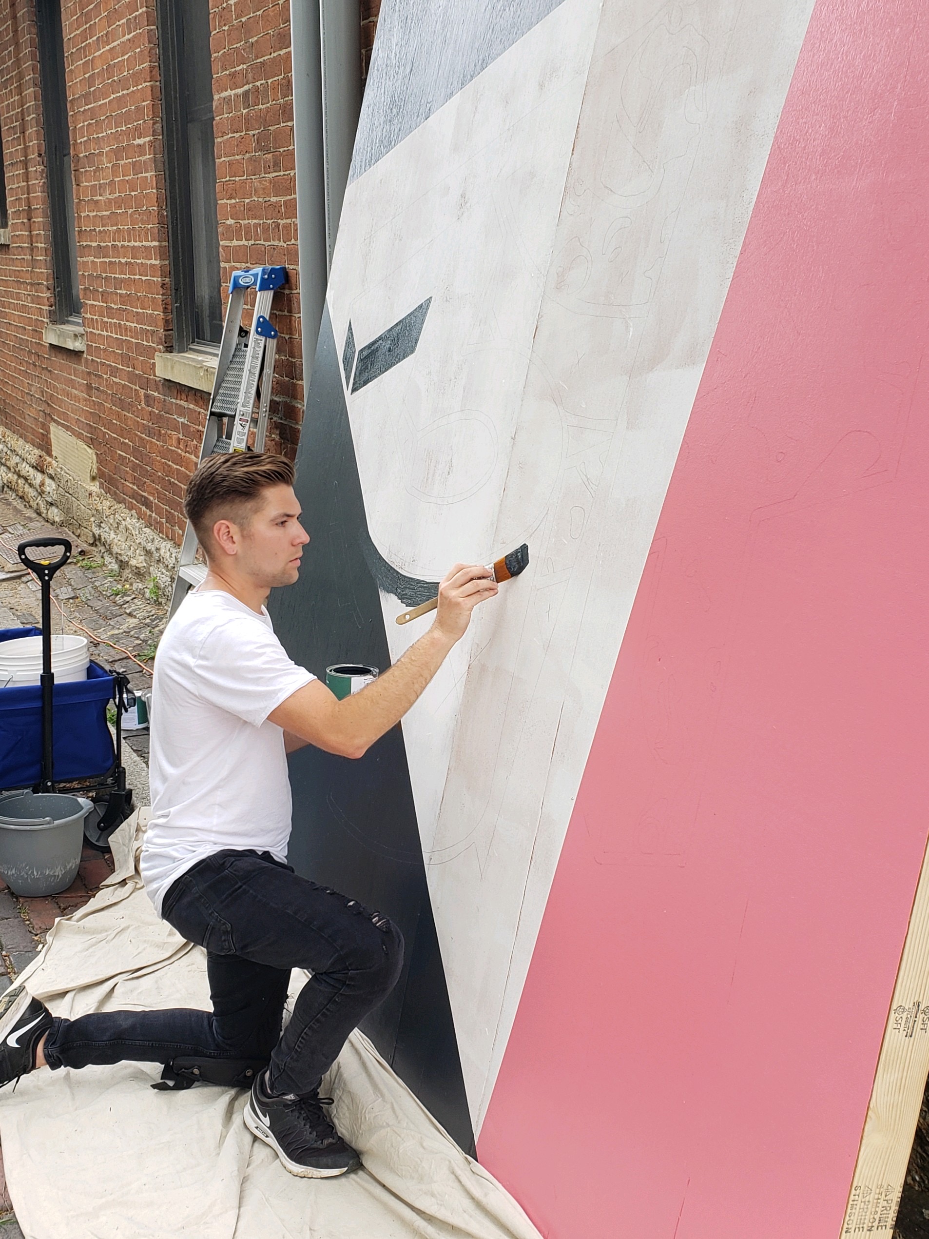
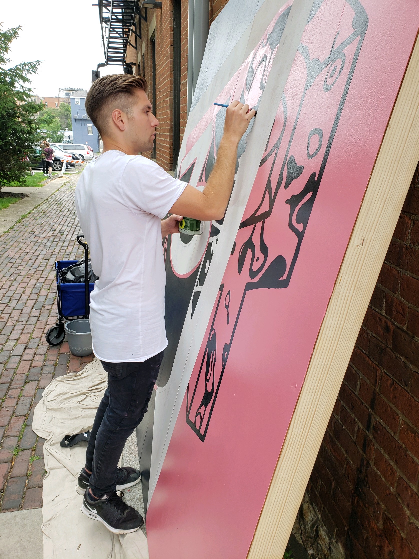
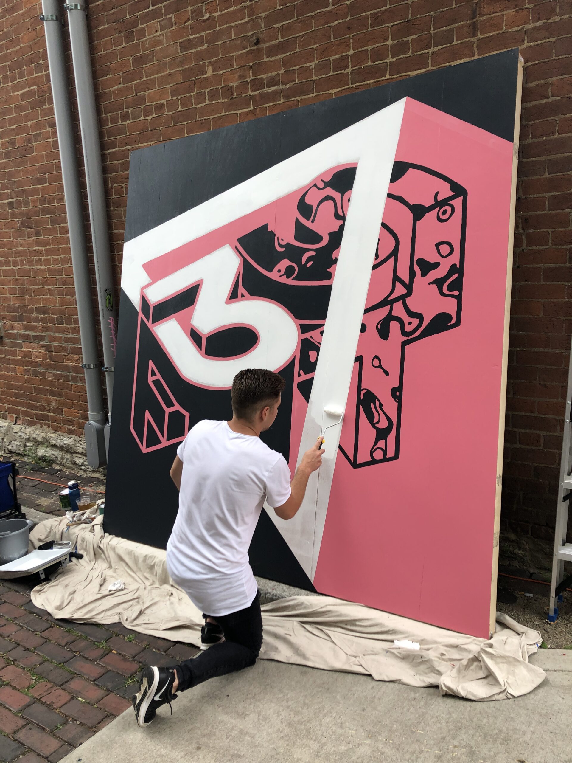
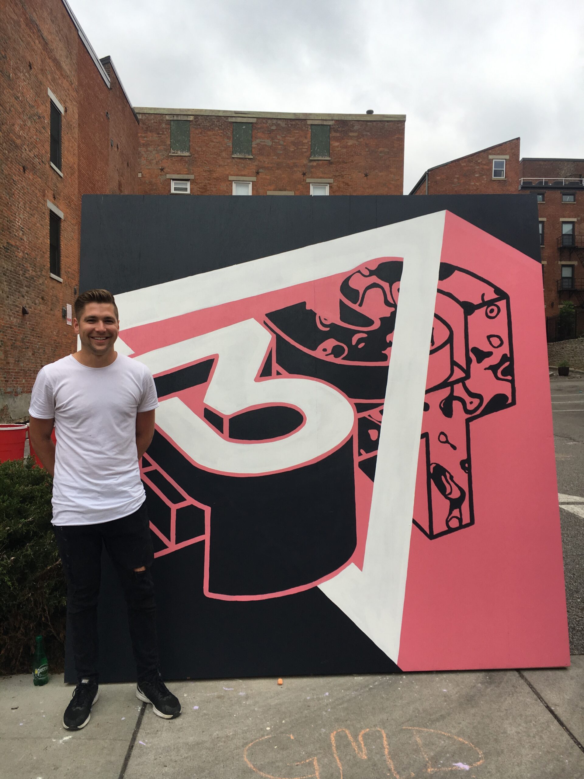
I was asked to be a part of an all day live art/mural session during 3 Points Brewery 1 year anniversary party. As I was a part of helping brand 3 Points, I knew I wanted to pay homage to the story/idea behind the brewery.
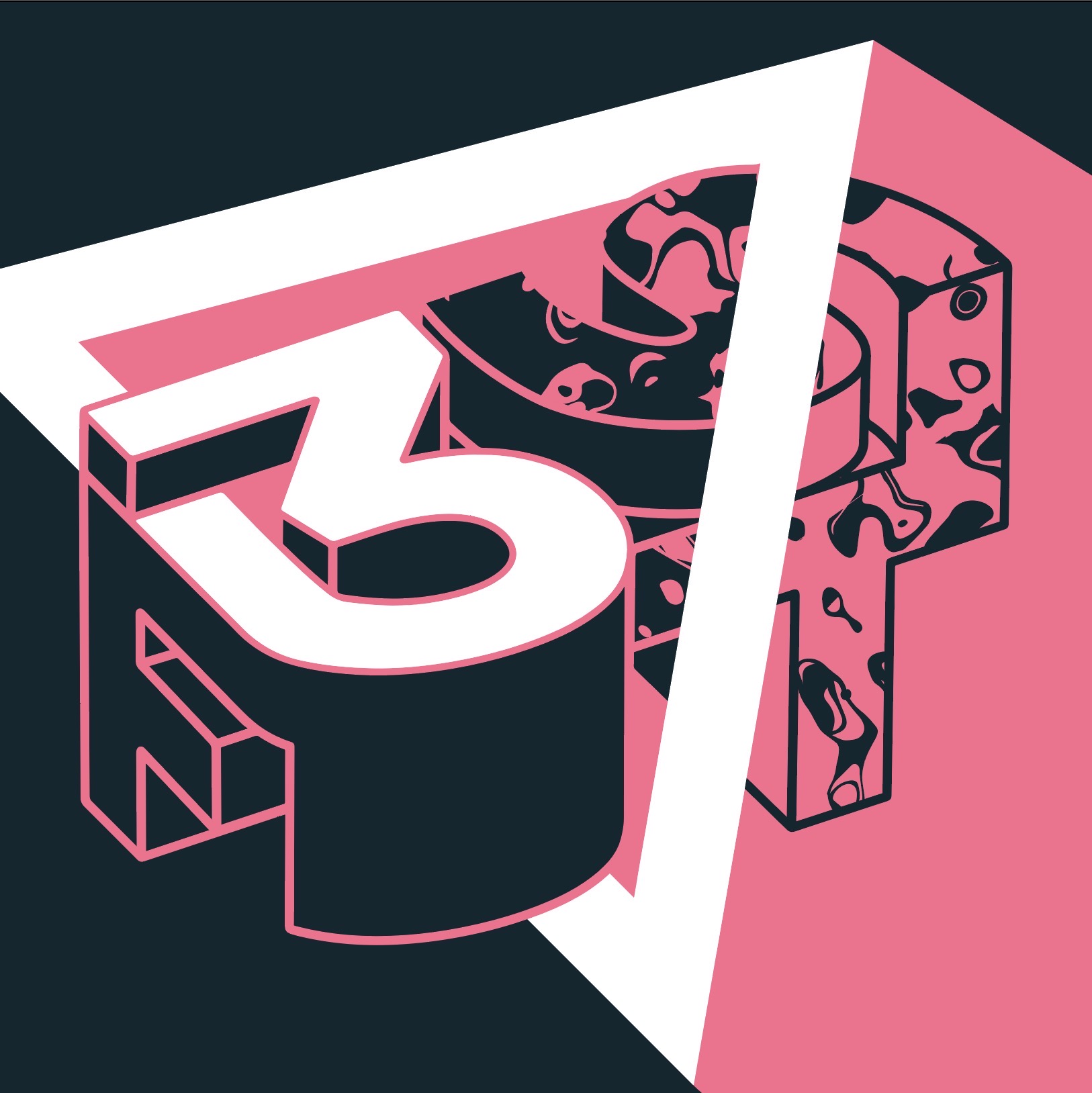
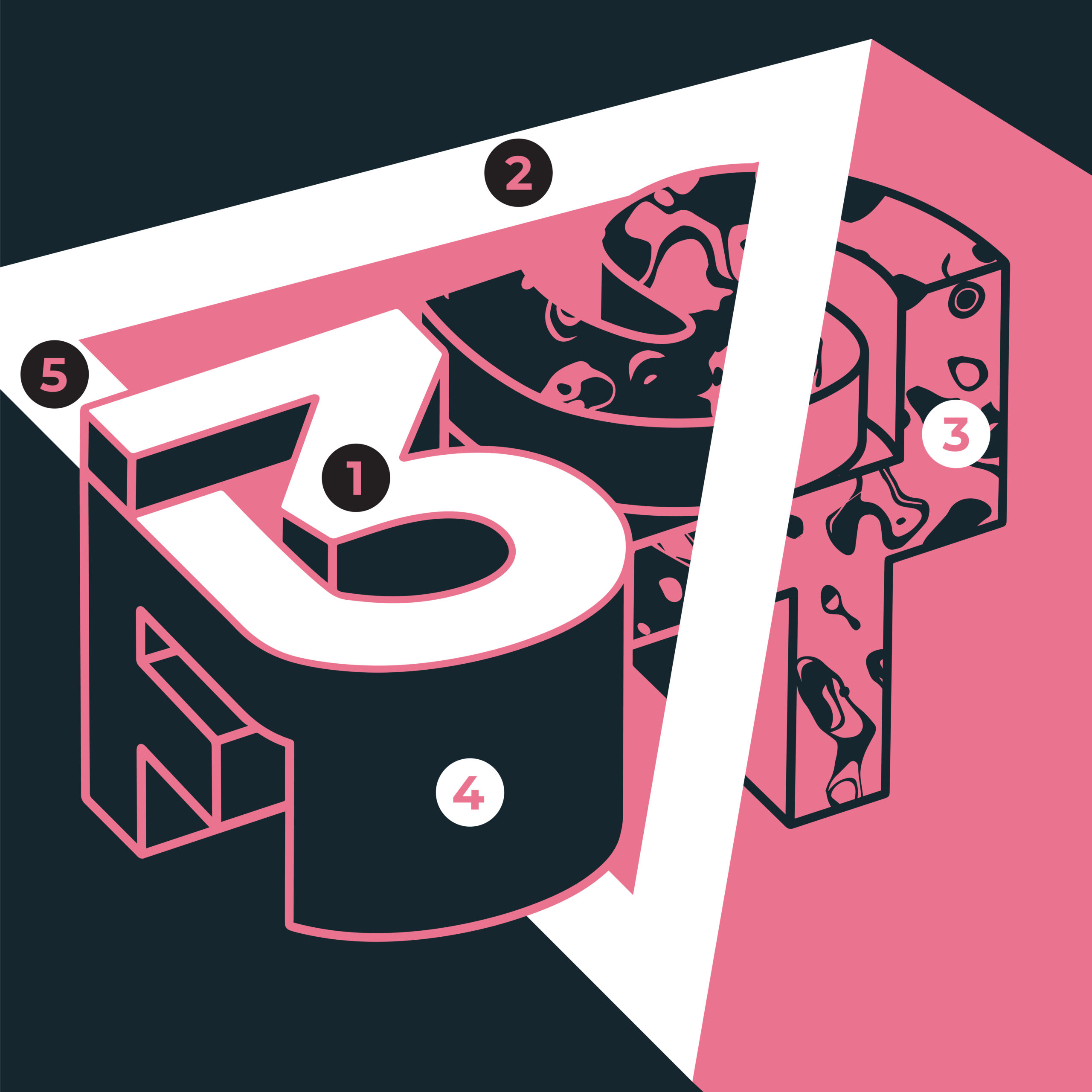
Deisgn Breakdown:
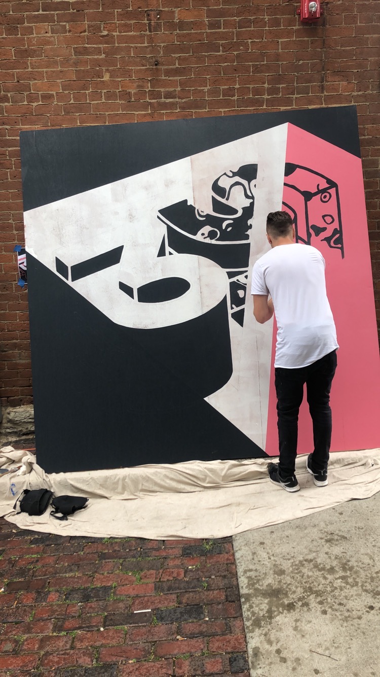
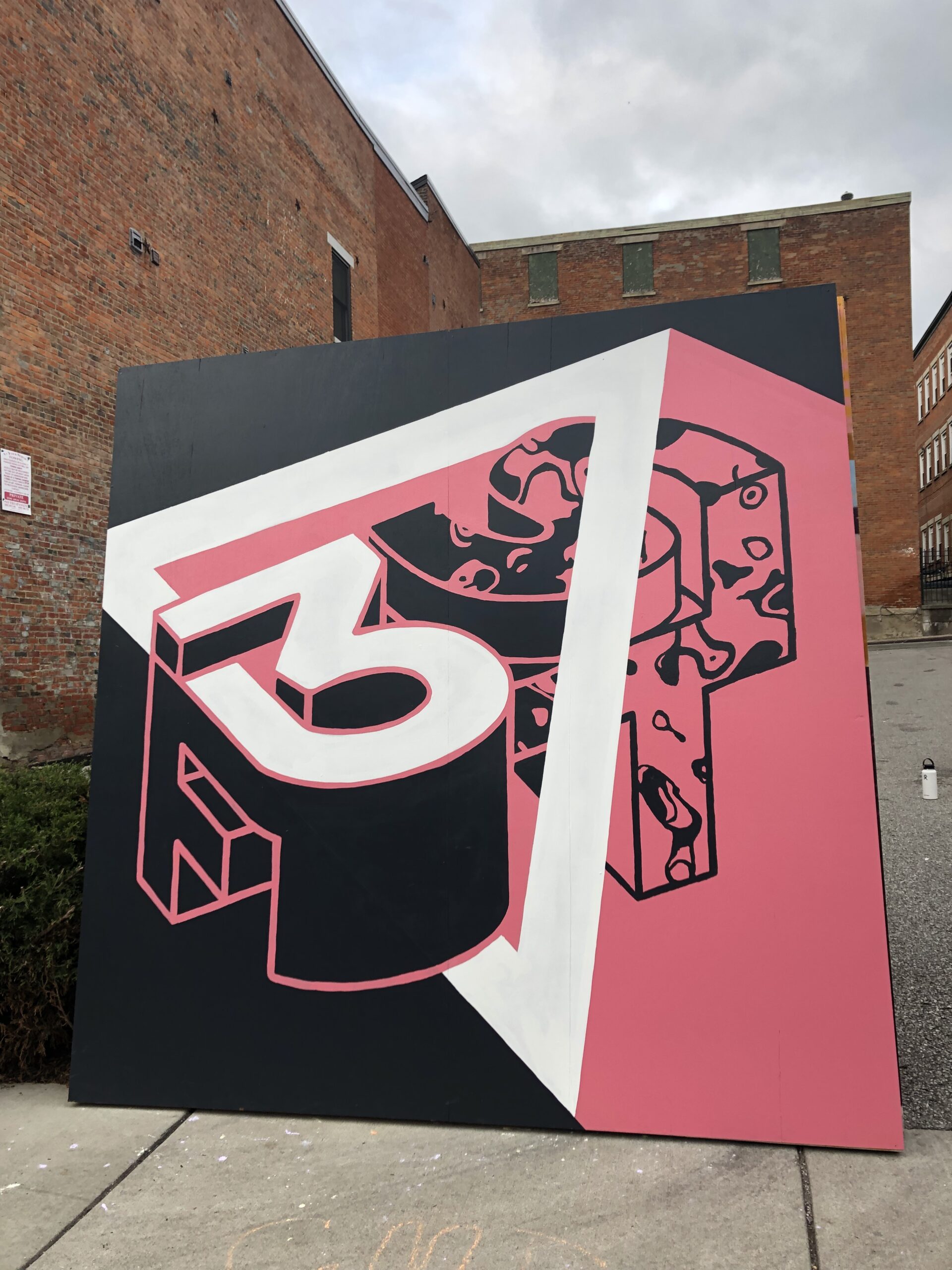
- The “3” is the logo from 3 Points branding and also takes place of the “E” in “Three Fest” (What the anniversary party was called).
- Triangle for the neighborhood/shape of Pendleton (3 Points location).
- Texture lives within the triangle/Pendleton - represents the art community within Pendleton.
- The “column” supporting the “3” is the foundation of 3 Points supporting the local community as being a hub for events in the area
- The “3” turning into the triangle representing 3 points working with/supporting the neighborhood of Pendleton.
